Categories
- Architecture (42)
- Awards (6)
- Behind the Build (9)
- Construction (36)
- Insights (58)
- Projects (15)
About Author
 Dave Milam
Tags

What if this coming Sunday morning, your church’s entire guest services ministry team didn’t show? Imagine no neon-vested minions directing traffic or over-caffeinated greeters guiding guests. I wonder if the scene might border on apocalyptic—with panicked pastors pacing the hallways, pandemonium in the parking lot and zombie-eyed parents, with kids in tow, left to fend for themselves. What if you were forced to rely solely on your facility’s design to guide each guest?
Think about it: Could every visitor flawlessly navigate an entire Sunday morning experience intuitively or would the self-guided experience result in a blundered debacle? And what happens to those people, often first-timers, who want to self-navigate your building and skillfully manage to evade your welcome team each week? You know it happens.
Strategic “wayfinding” is one of the best ways to curate a more intuitive experience and help your guests navigate your facility intuitively. Clear directional signs that guide and move people through ministry environments will empower guests to take control of their own spiritual experience from day one. So, if you want to improve your church’s wayfinding experience, here are seven steps that will help you develop a successful plan to make the guest experience more intuitive.

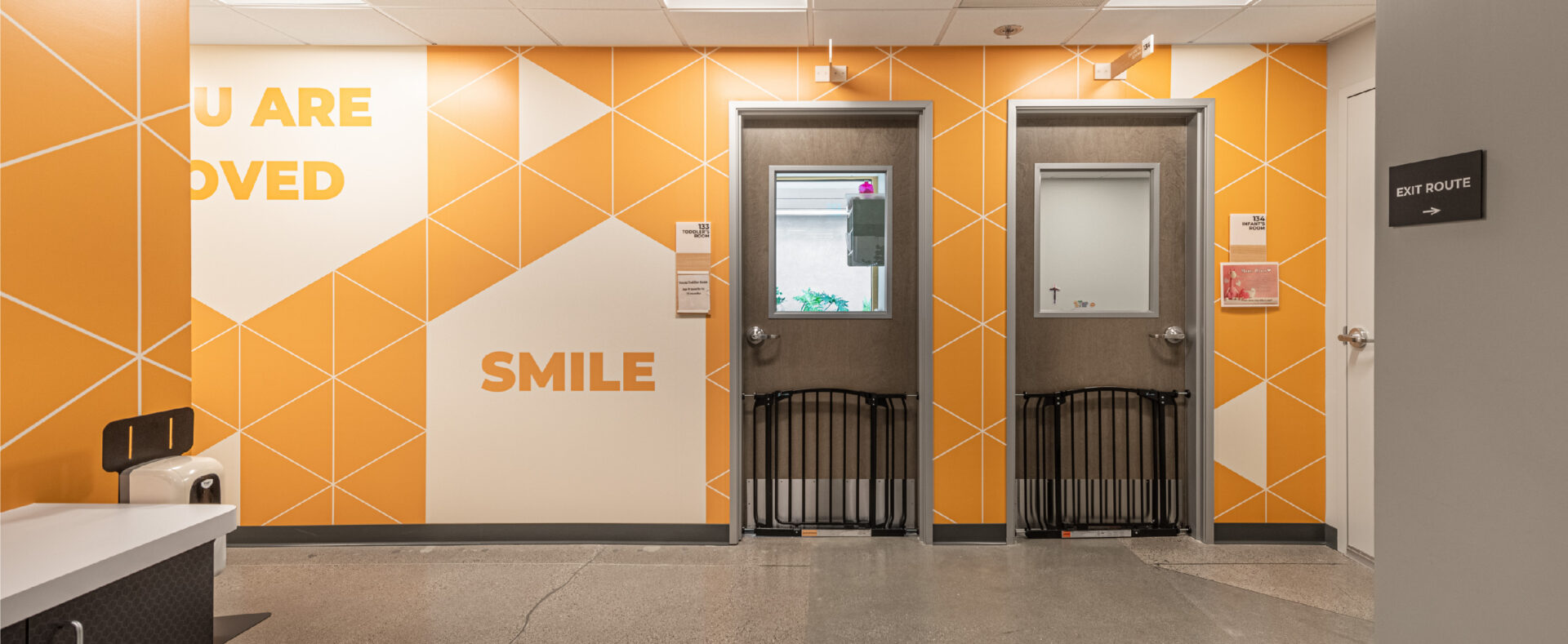
Mesa Church | Irvine, CA
The first step to effective wayfinding is to simplify the options by consolidating your ministries to different “districts.” Think about it, grocery stores group all of the dairy, meat, and bread into their unique districts. It’s what makes finding hamburger so intuitive. Home improvement stores have both plumbing and painting districts. It’s even likely that your socks and jeans don’t live in the same dresser drawer but have their own “districts.”
And when it comes to technology, some of the most intuitive apps on your phone display only 2–4 buttons on your screen at a time. The app may organize the library of a billion songs, yet there are still only 2–4 choices available at a time. Simplicity is what makes complexity usable.
If you want to make your building more intuitive, then your ministries should also be grouped into similar districts throughout your building. For example, children should all be together in a secure district that is visually differentiated from all the other parts of the building. Additionally, there should be a youth district, worship district, admin district and a district for connecting and coffee.
If ministries indiscriminately sprawl across your campus without clear districting, effective wayfinding is nearly impossible. And if you’re finding it impossible to adequately organize and district ministry environments, then simply recognize the challenge as a symptom of a more significant design problem that has evidenced itself as a wayfinding problem. And do your best with what you’ve been given now.
Guests crave simplicity and clarity. So, for heaven’s sake, make sure the names of your environments actually describe what they are. As a guest, I just want to know where the coffee is and where to drop off my kids. So when you use the Greek word for “coffee” to name the coffee corner or some creative nonsensical jib jab to brand your kids check-in, it’s not helpful (even though it may be super creative).
Know where to get creative and where to use common sense design patterns. And when it comes to creating intuitive spaces, always favor clarity over creativity.
If you live on the North West side of Atlanta, you may be familiar with the “Big Chicken,” and if you’re in Inglewood California, you’ll know the giant donut that sits atop of “Randy’s Donuts.” Landmarks anchor space and create cues that help guests remember where they are.
Have you ever thought about creating some landmarks in your building? When you develop landmarks or change a district’s scenery, it’s much easier to know where you are and where you’re going. But, if all of the hallways look identical, guests can begin to feel like a rat in a maze.
Don’t overthink this one. A grouping of green chairs in the corner or a series of unique wall graphics may be enough to quickly galvanize directions into a guest’s memory.
Keep in mind that great “way-finding” doesn’t always demand a directional sign mounted on the wall. Sometimes, the best label is a robust branded space that intuitively directs your guests.
Your main entry door should be unmistakable—no sign required. Four-year-olds should be naturally drawn to your kids’ environment and intuitively know where they belong.
Anxious guests will want to quickly scan the text on a sign as they walk into your building for the first time to keep from asking for help. So, it’s critical that you choose the perfect font if you want to improve your wayfinding experience.
Keep in mind that your company’s official brand font may not be the most effective typeface for your wayfinding project. There’s a reason that 75 percent of the world’s airports use one of three fonts: Helvetica, Frutiger, and Clearview. Because when it comes to wayfinding, clarity is king.
So, when you’re choosing your wayfinding font, look for a font family that is legible and includes a package of many different weights; typically san serif. Once you have landed on a font, give your typeface a test drive for clarity with this method: in Photoshop, layout the new typeface with some sample phrases then crank up the gaussian blur. Now, step back a few feet and check to see if you can tell the difference between the “O” and the “Q,” the “B and the “R,” and the “C” and the “G.”
After you choose the right font, you’ll need to make sure that the text is appropriately sized for viewing. So, here’s a good rule of thumb: every inch of letter height provides approximately 10 feet of readability. That means that 4-inch letters will have the maximum impact within 40 feet of viewing.
Make sure that the font is resting on a high contrast background in your design. And for the love of all things holy, please don’t use Papyrus or Comic Sans – even in your kids’ environment.
The sixth step to improve wayfinding is where most projects stall out. Plan making is where the rubber meets the road, and the hard work really begins.
Grab a copy of your church’s floor-plan and start to mark down proper placement for each type of sign in your wayfinding arsenal: informational signs, directional signs, traffic signs, parking signs, and room signs. And in larger environments or when mounting a sign is nearly impossible, consider utilizing a static gobo light to project a directional sign on the floor.
Limit the number of options to no more than five choices on a given sign and make sure to keep sight lines in mind. Oh, and don’t forget to communicate where folks can find the restroom … that’s super important.
Good luck.
If you’re a designer, it’s super tempting to overthink and over-design a directional sign. Trust me, I’ve done it a hundred times. I’ve even seen “designers block” stall out the entire wayfinding project. Don’t over think it. Simple, thoughtful design will serve your guests better than any pimped-out placard that you could piece together.
You’re not likely to win a national design award on this project, so let it go. Just trust that the sign will do its job by clearly and elegantly pointing the way, and you’ll hit the mark. Clarity is the key.
The hard work you put into your church’s wayfinding will be some of the most valuable work you can do to yield a more intuitive and memorable guest experience.
